Altas of Madagascar lemurs and their vulnerability to climate change
G. Vieilledent \(^a\), C.Knoploch, C. Grinand \(^b\), F. Montfort \(^b\), M. Nourtier \(^b\)
19 septembre, 2019
Foreword
\(^a\) : CIRAD (Montpellier, FRANCE)
\(^b\) : NITIDAE (Montpellier, FRANCE)
This biodiversity atlas is a prototype obtained with the R package speciesatlas. It is part of the BioSceneMada project (https://bioscenemada.cirad.fr/)
We use the biomod2 R package to model species distribution and perform model averaging. Five statistical models are used: GLM, GAM, Random Forest, Maxent and ANN to infer species climatic niche from occurrence data. For estimating species vulnerability to climate change, we forecast future species distribution using climate projections in 2050 and 2080. We used the projections of three global climate models (GCMs), following the representative concentration pathways (RCPs) 4.5 and 8.5. GCMs were obtained from the Coupled Model Intercomparison Project Phase 5 (CMIP5) of the Intergovernmental Panel on Climate Change (IPCC). We use the following three contrasted GCMs: CCSM4, GISS-E2-R and HadGEM2-ES. Climatic data are obtained from the MadaClim website (https://madaclim.cirad.fr) which provides the CCAFS GCM future climate data (http://www.ccafs-climate.org/data/) specifically for Madagascar.
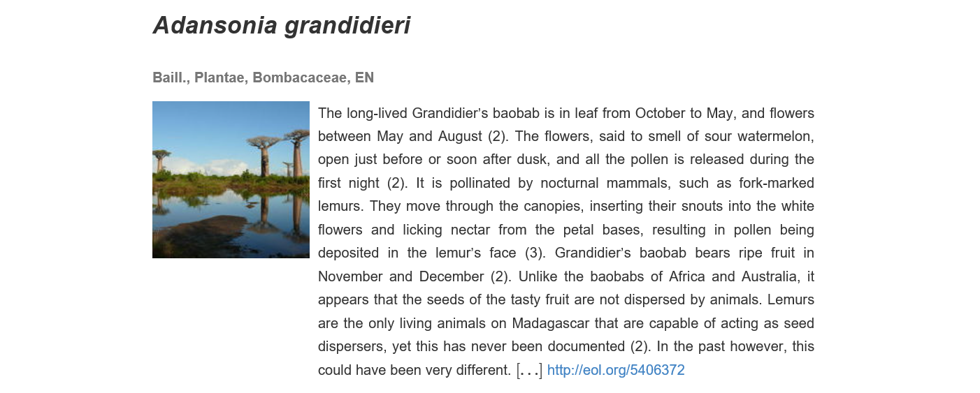
Figure 1: The top head of an atlas page.
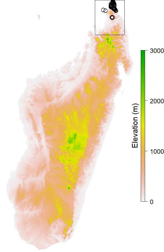
Figure 2: The map showing the points of presences
On top of the page (Fig. 1) there is the name of the species, its taxonomy with the kingdom and the family. When available there’s also the authority (name and year) and the IUCN status (http://www.iucnredlist.org/). It is an endangerment indicator for every species, with different levels of threat like Least Concern (LC), Vulnerable (VU) or Critically Endangered (CR). Below these, there are descriptive image and text (when available). A link to the corresponding Encyclopedia of Life page is given for every species. The first map (Fig. 2) is showing all the occurences of the species with the map of the area for background. If the occurences are really gathered, a black rectangle shows the extent of the other maps. The number of occurences for the species is written on the right of the maps.

Figure 3: The map presenting the results of the models for the present.
| ROC | OA | TSS | K | Sen | Spe | |
|---|---|---|---|---|---|---|
| Value | 0.99 | 0.88 | 0.84 | 0.11 | 96.59 | 84.35 |
Every species have those items in common, but the presence of the other informations depend on the number of occurences for the species. We chose not to run the models if the species presentes less than 10 observations. For those species, there isn’t anything else on the atlas page. For other species with enough occurences, the results of the models are presented over several maps and tables. The second map (Fig. 3) is showing the binary vote for every model concerning the presence of the species. We chose 5 models of BIOMOD2 : Generalized Linear Model (GLM), Generalized Additive Model (GAM), Random Forest (RF), Maximum Entropy (MaxEnt) and Artificial Neural Network (ANN).If 3 models or more are considering the presence on a pixel, we admit the species is present there, and it is colored in green on the map. Also there is a table that shows the values for the effectiveness indicators.
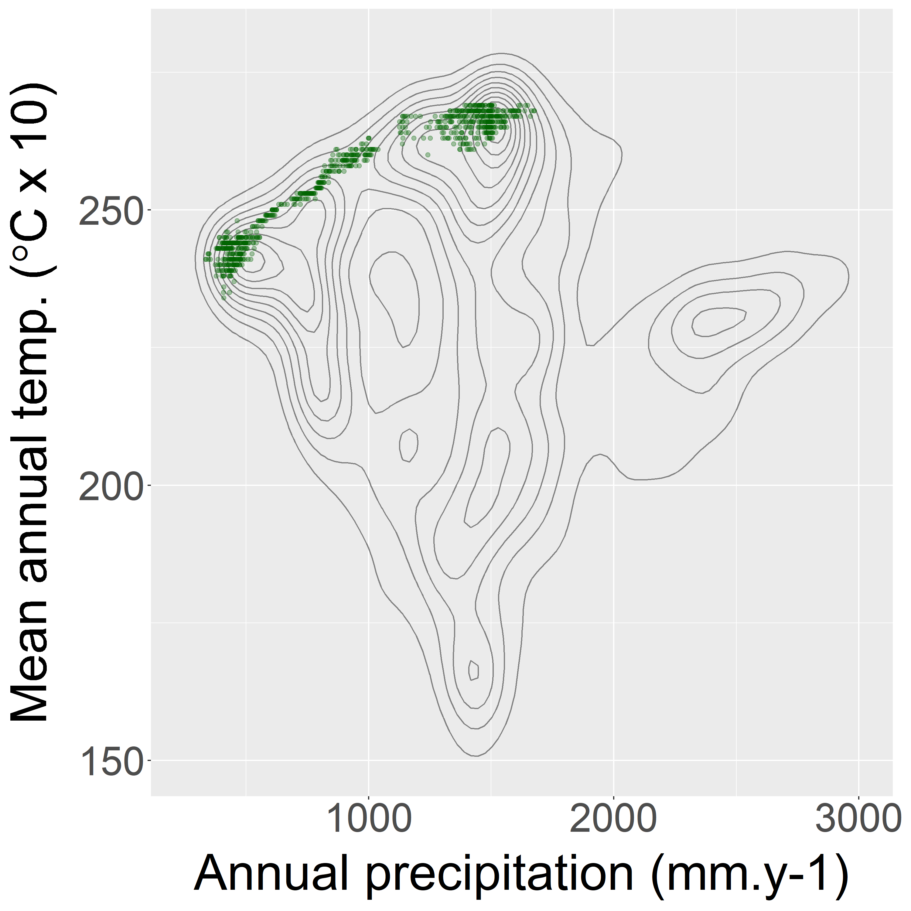
Figure 4: The climatic niche.
| temp | tseas | prec | cwd | alt | |
|---|---|---|---|---|---|
| Mean | 206 | 2526 | 1881 | 49 | 706 |
| 2.5% | 170 | 2215 | 1358 | 0 | 19 |
| 97.5% | 232 | 2745 | 2450 | 151 | 1406 |
On the following section, the graph (Fig. 4) represents the climatic niche of the species based on the relationship between annual precipitation and mean annual temperature : every species is marked by a dot at the intersection of its value for the two variables. It allows us to see if the species only live under certain conditions. For most of the species, those climatic niches are relatively gathered. Afterthat there’s a first table that informs us on the environmental tendancy for places where individuals of the species where detected. There are the mean and quantiles for every variable studied, it gives an idea on the environment this species need. The second table gives information on the importance of the climatic variables. In other words it designates which are the variables that are conditioning the most the presence of the species. We can read the results for every 5 models of BIOMOD2, and there’s a synthesis on the two last columns.
| GLM | GAM | RF | MaxE | ANN | mrank | rank | |
|---|---|---|---|---|---|---|---|
| temp | 0.38 | 0.20 | 0.56 | 0.14 | 0.14 | 3.00 | 3 |
| tseas | 0.20 | 0.30 | 0.67 | 0.22 | 0.37 | 2.20 | 2 |
| prec | 0.10 | 0.09 | 0.35 | 0.14 | 0.49 | 3.60 | 4 |
| cwd | 0.88 | 0.90 | 0.65 | 0.96 | 0.84 | 1.20 | 1 |
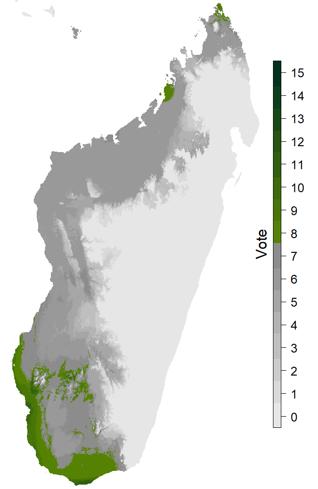
Figure 5: The map with extreme scenario and dispersion.
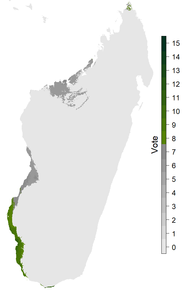
Figure 6: The map with extreme scenario and no dispersion.
The last section of the page is presenting the results obtained for the different future scenarioscoming from the IPCC (https://www.ipcc.ch/). The two maps (Fig. 5, 6) are the extreme cases (RCP8.5 and 2080) with or without dispersion. There’s 15 levels on the legend because of the 5 models and the 3 GCMs. For every GCM we have the binary response for every distribution model. That time we consider the species present on a pixel if at least 8 out of 15 answers are positive. Summing these pixels provides us the new Species distribution area for this scenario, and we can measure the percentage of variation relative to the projection for the present. Those informations are in the two last columns of the table.
| RCP | Year | Disp | Area | Change | |
|---|---|---|---|---|---|
| 1 | 45 | 2050 | full | 55 893 | -22 |
| 2 | 45 | 2050 | zero | 45 728 | -36 |
| 3 | 45 | 2080 | full | 55 370 | -23 |
| 4 | 45 | 2080 | zero | 45 224 | -37 |
| 5 | 85 | 2050 | full | 30 677 | -57 |
| 6 | 85 | 2050 | zero | 28 549 | -60 |
| 7 | 85 | 2080 | full | 13 632 | -81 |
| 8 | 85 | 2080 | zero | 11 136 | -84 |